
Many of you might already know what a fishbone diagram is. But do you know how to actually draw one? And what should you watch out for when creating one?
As the name suggests, the diagram looks like the skeleton of a fish—that’s where it gets its nickname. Its formal name is Cause-and-Effect Analysis Diagram, because it’s used to trace a problem (effect) back to its possible causes.
Originally, fishbone diagrams were used in product design to analyze causes of failure, or in manufacturing to find the root cause of quality issues and come up with solutions. Nowadays, people use it in many industries to solve everyday work and life problems too.
Some people also call it the Ishikawa Diagram, named after Dr. Kaoru Ishikawa, a Japanese quality control expert who developed this tool.
Drawing a fishbone diagram is actually very simple. The basic version just uses a few arrows. If you’re someone who likes a little more creativity, check out Workingbear’s YouTube video: “How to Draw a Unique Fishbone Diagram in PowerPoint. (Chinese Version Video)”
When quality instructors teach us how to draw fishbone diagrams, they usually mention that there are two main styles, based on the direction the fish’s head points.
- When the fish head points to the right, it’s a “Cause-Oriented” Fishbone Diagram. The head represents the problem, and the bones show possible causes.
So, you write the problem that has already occurred at the fish’s head.
The topic usually starts with “Why…” or directly names the issue, like:- “Why am I often late to work?”
- “Why is the SMT component attrition rate so high?”
Then, list the possible causes along the bones of the fish.
- When the fish head points to the left, it’s a “Solution-Oriented” Fishbone Diagram. The head represents a goal, and the bones list potential solutions or actions.
The topic often starts with “How to improve/prevent/solve…”, like:- “How to avoid being late to work?”
- “How to reduce the SMT component attrition rate?”
Then, write possible countermeasures along the bones.
When used correctly, a fishbone diagram can be a powerful tool to solve tough problems. In everyday life or at work, we often face issues. Some problems are simple—you can identify the cause right away, so no diagram is needed.
But other times, the cause is hidden and hard to figure out. Our thoughts may become too scattered or unfocused to find the real root. That’s when a Fishbone Diagram comes in handy.
It helps you sort out all those scattered thoughts, narrow them down, and find the main possible causes. After that, you can collect data, use stratification analysis, or prioritize the possible causes, verify them one by one, and finally take action with a solid, long-term solution.
So, before you draw a fishbone diagram, you should already have some ideas about what might be causing the problem.
Actually, whether you have ideas or not, Workingbear strongly recommends gathering a cross-functional team for a brainstorming session.
List all possible causes based on the problem, then use the fishbone diagram method to organize and discuss the likelihood of each cause.
As the saying goes, “Two heads are better than one,” and this kind of teamwork helps prevent blind spots or tunnel vision.
Now, let’s walk through how to hold a meeting to create a fishbone diagram:
- Gather the Right People
Bring together everyone related to the issue, or those with relevant knowledge or experience.
Avoid having just one person draw the diagram alone.
A good group size is around 4 to 10 people. - Use a Whiteboard or Large Sheet of Paper
It’s a good idea to have several colored markers—each person can use a different color.
These days, many people also use mind-mapping software to draw the diagram digitally. - Start Drawing the Fishbone Diagram
Begin by sketching a basic fishbone shape on the board or paper, with the head pointing to the right (arrow to the right).Write the problem clearly at the head of the fish.
Be sure to describe the issue in detail—its characteristics, symptoms, or signs—so everyone understands the context.Label the main bones with major causes, the branches with sub-causes, and the small tips with minor causes.If you’re analyzing design or manufacturing issues, many experienced teams use the classic 6M categories for the major causes: Manpower, Method, Material, Machine, Measurement, and Mother Nature (also call Environment).These six categories usually cover all types of causes and often relate to different departments, helping the team think broadly and clarify responsibilities.Of course, you’re free to group your main causes differently—it doesn’t have to follow the 6M structure.
Also, remember to place more likely or direct causes closer to the fish’s head, and less likely or distant causes nearer the tail.This helps focus attention on the most probable causes.The goal is to make it easy for others—especially people unfamiliar with the issue or decision-makers—to quickly see which causes are major and which are minor.After all, reports are often made for others, so if your fishbone diagram is clear, there’s less need for further explanation.
- Take Turns Sharing Causes
Each participant should take 15–20 seconds to say one possible cause.Keep going without interruptions.
No criticizing or questioning allowed during this phase.
The host or a note-taker writes down each point on the diagram. - Time Limits
Limit each person’s speaking time to 20 seconds before moving to the next.
After a few rounds, once you’ve gathered 60–80 potential causes, or people stop contributing, wrap up the brainstorming.Try to keep the whole session under 30 minutes. - Prioritize the Causes
Now go through the list of causes.
Have each participant pick the ones they believe are most significant.Circle these in red on the diagram once the group agrees. - Narrow Down the Key Causes
Next, go through the circled causes again.
Let everyone pick out the most critical ones from the red circles.
Mark those with a second colored circle.Repeat this process until no more can be added.
Finally, review the entire fishbone diagram. The causes with the most circles are likely the main culprits behind the problem.
Now it’s time to take action and find solutions based on those key causes.
Now, let’s take a look at this fishbone diagram example: “Why have I been showing up late to work recently?”

This is a typical right-facing fishbone diagram, used to trace the possible causes of a problem.
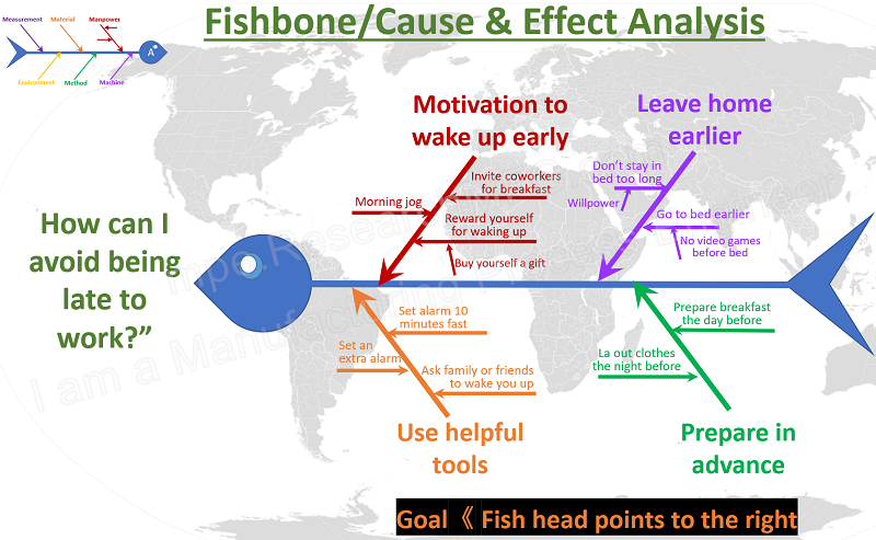
And here’s another one: “How can I avoid being late to work?” This is a left-facing fishbone diagram that focuses on finding solutions.
The next example is something Workingbear previously shared on the blog—A fishbone diagram about the source of oil contamination on keypad circuits.
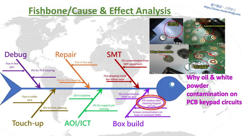
Back then, Workingbear explained that a product at a previous company had a serious DOA (Dead On Arrival) complaint. Most of the defective units had unresponsive keypads, specifically on the 3, 6, and 9 keys. The root cause turned out to be oil contamination. My company formed a temporary task force to investigate, even sending engineers to the contract manufacturer’s factory.
To their credit, the factory was cooperative and had already done some internal troubleshooting on their own.
After a detailed investigation and summarizing findings with a Cause-and-Effect Diagram, the most likely root cause pointed to an operator mistakenly using flux instead of IPA (isopropyl alcohol) as a cleaner. This flux was applied directly to the keypad contact circuits on the PCB.
Even though the source of the oil was identified, verifying it became another challenge. Here, Workingbear briefly explained the two-part verification process simply:
First, we sent the returned defective units to a lab for chemical analysis.
We used FTIR (Fourier Transform Infrared Spectroscopy), because EDS (Energy-Dispersive X-ray Spectroscopy) only detects elements, not compounds. The result showed a mixture of IPA and flux.
Second, we simulated three possible contamination scenarios:
- IPA only
- Flux only
- A mixture of IPA and flux
We applied each substance to the PCB circuit, then assembled the units immediately and let them sit for 24, 48, and 72 hours. The results showed that the flux-only samples looked most similar to the actual oil stain issue—but didn’t show any white powder. The IPA and flux mixture did produce white powder, but didn’t recreate the oily appearance. So, the likely culprit was a flux-heavy mixture of IPA and flux.
Eventually, the contract manufacturer admitted that their operators may have mistakenly used flux instead of IPA.

And during our on-site audit, we found that both flux and IPA were stored in the same cabinet! To a new operator, the two containers might have looked the same, which made it easy to confuse one for the other.
This mix-up likely led to cross-contamination and the use of the wrong cleaning agent.
《YouTube》QC 7 tools – Cause and Effect Analysis (Fishbone) Diagram Introduction
This video uses English dubbing to test out YouTube’s “automatic dubbing” feature. You can switch between different languages in the video, including English, French, Japanese, Korean, Spanish, Portuguese, Indonesian, Polish, Dutch, Italian, and more. Feel free to try it out and see how well YouTube’s automatic dubbing works.
《Podcast》EP026E-QC 7 tools – Cause and Effect Analysis (Fishbone) Diagram Introduction
Related Posts:

![[Case Study] Troubleshooting a Customer Complaint – Keypad Malfunction Caused by Oil & Powder Contamination on the PCB [Case Study] Troubleshooting a Customer Complaint – Keypad Malfunction Caused by Oil & Powder Contamination on the PCB](https://mpe.researchmfg.com/wp-content/uploads/2025/Oil_on_PCB_summary-mpe.jpg)



Leave a Reply